Child Therapy Website Design
One-Page Squarespace Website for a Counselling Collective

One-Page Squarespace Website
Sand & Stone is a child & youth counselling collective based in Squamish, British Columbia, offering therapeutic support to children, teens, and families through a multidisciplinary team of practitioners.
Location:
Squamish, BC. CanadaIndustry:
Child & Youth CounsellingServices:
Digital Brand Essentials: Text-based logo, colour palette, typography system
Squarespace website design for small business
Stock photography curation and research support

Child Therapy Website Design
Calm. Trust-building. Child-centered.
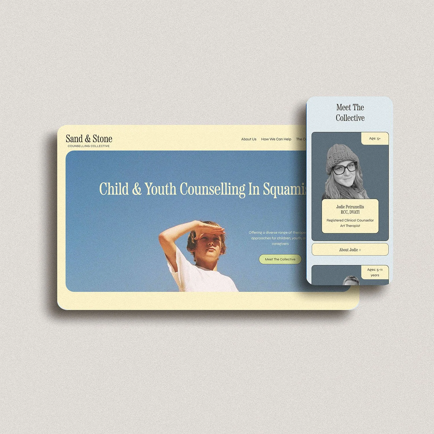
Sand & Stone needed a child therapy website that would feel reassuring, warm, and grounded—while clearly presenting a collective of therapists with different specialties and approaches. The site needed to speak primarily to parents and caregivers, while remaining accessible to youth and reflective of the collective’s values.
The goal was to create a therapy website that builds trust quickly, avoids overwhelm, and helps families find the right therapist with clarity and ease—without relying on complex navigation or multiple pages.
The collective offers a range of therapeutic approaches, including art therapy, counselling, sports psychology, and parent/caregiver consultation, allowing families to find support tailored to their child’s needs.
The Approach
This project focused on clarity, emotional safety, and simplicity—both visually and structurally. The site was designed as a one-page Squarespace website for therapists, intentionally structured to reduce friction while still allowing depth through layered interactions.
Structure & User Experience
The website was designed as a single, scroll-based page, allowing visitors to absorb information gradually without navigating multiple pages. Content is intentionally paced, with clear visual breaks and a rhythm that mirrors a therapeutic environment. This structure is particularly effective for counselling collectives, where families often want to explore multiple practitioners before choosing the right fit.
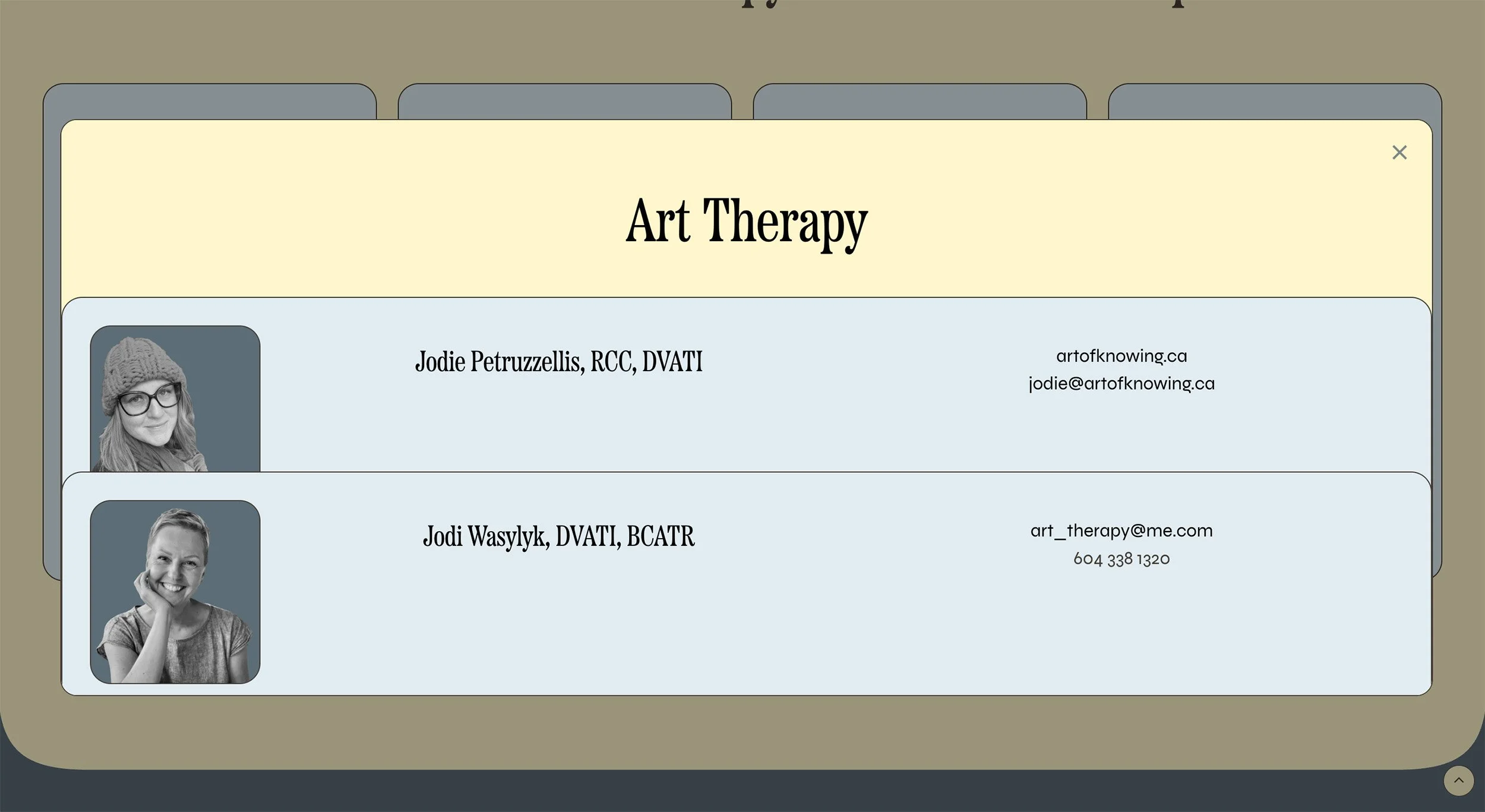
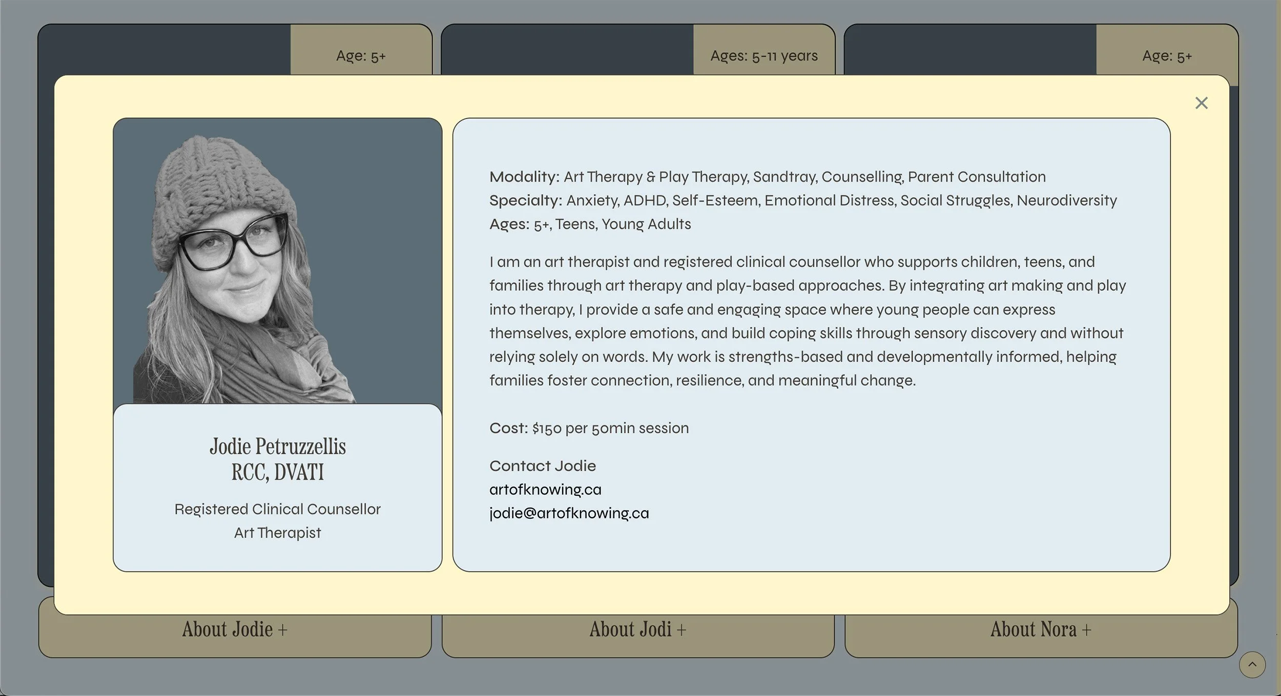
Collective Navigation Logic — therapists are presented through layered lightboxes, allowing families to explore the team and individual profiles without disrupting the overall flow of the page. This keeps the experience intuitive and non-disruptive, particularly for parents navigating quickly.
Visual Direction
The visual identity was designed to support a mental health website context—soft, balanced, and welcoming, without appearing clinical or overly playful. Design decisions were guided by emotional safety, ensuring the site feels approachable and non-intimidating for both caregivers and youth.
A soft pastel palette of yellow, blue, and green, balanced to support a calm, therapeutic experience
Gentle contrast for readability and accessibility
Rounded shapes and spacing to soften the layout
Stock photography curated to reflect care, connection, and diversity
Every visual choice supports trust, clarity, and ease.
Website Design & Build
The site was built in Squarespace using custom styling and layout refinement to elevate a one-page structure into a fully professional experience.
Key design considerations included:
Clear content hierarchy for scanning
Calm, highly readable typography
Flexible sections that allow the collective to grow
Simple, reassuring calls-to-action
The site was designed to be easily maintained by the client, with no ongoing technical complexity.
Features & Highlights
One-Page Therapist Website Design — clear, structured, and easy to navigate
Therapist Lightboxes — team and individual profiles revealed without page changes
Digital Brand Essentials — colour palette, typography, and visual consistency
Stock Photography Curation — cohesive, child-appropriate imagery
Collective-Focused Layout — balances individual practitioners with shared identity
Accessibility-conscious Layout — clear hierarchy, generous spacing, and readable typography
The Result
Sand & Stone now has a calm, professional child counselling website that reflects their collective approach and supports families seeking care in Squamish and the surrounding areas. The one-page structure reduces friction, while layered interactions allow the collective to present depth without complexity.
The site creates an immediate sense of trust and care—supporting families in taking the first step toward counselling, while giving the collective a flexible foundation that can evolve as the practice grows.
HOVER TO REVEAL THE website


